
How lightweight interactions make creator sites feel complete
A practical framework for deciding where lightweight components should improve a creator website.
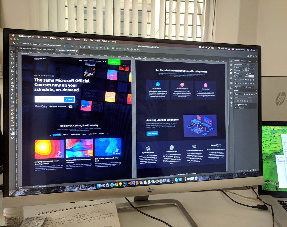
Small interaction details can make a creator website feel more deliberate without turning it into a heavy app.
Start with the moments users repeat
Navigation, product cards, forms, copied text, image comparisons, and small confirmations are usually the best places to add lightweight components.
A good component should make the page easier to use first, and more polished second. That order keeps performance, clarity, and accessibility from becoming afterthoughts.
Keep the install path simple
For ZIDER, the ideal component has a clear preview, a few practical settings, and a safe publishing flow. The creator should understand the result before touching production.
See how the product line is organized in Components.